# Getting Started
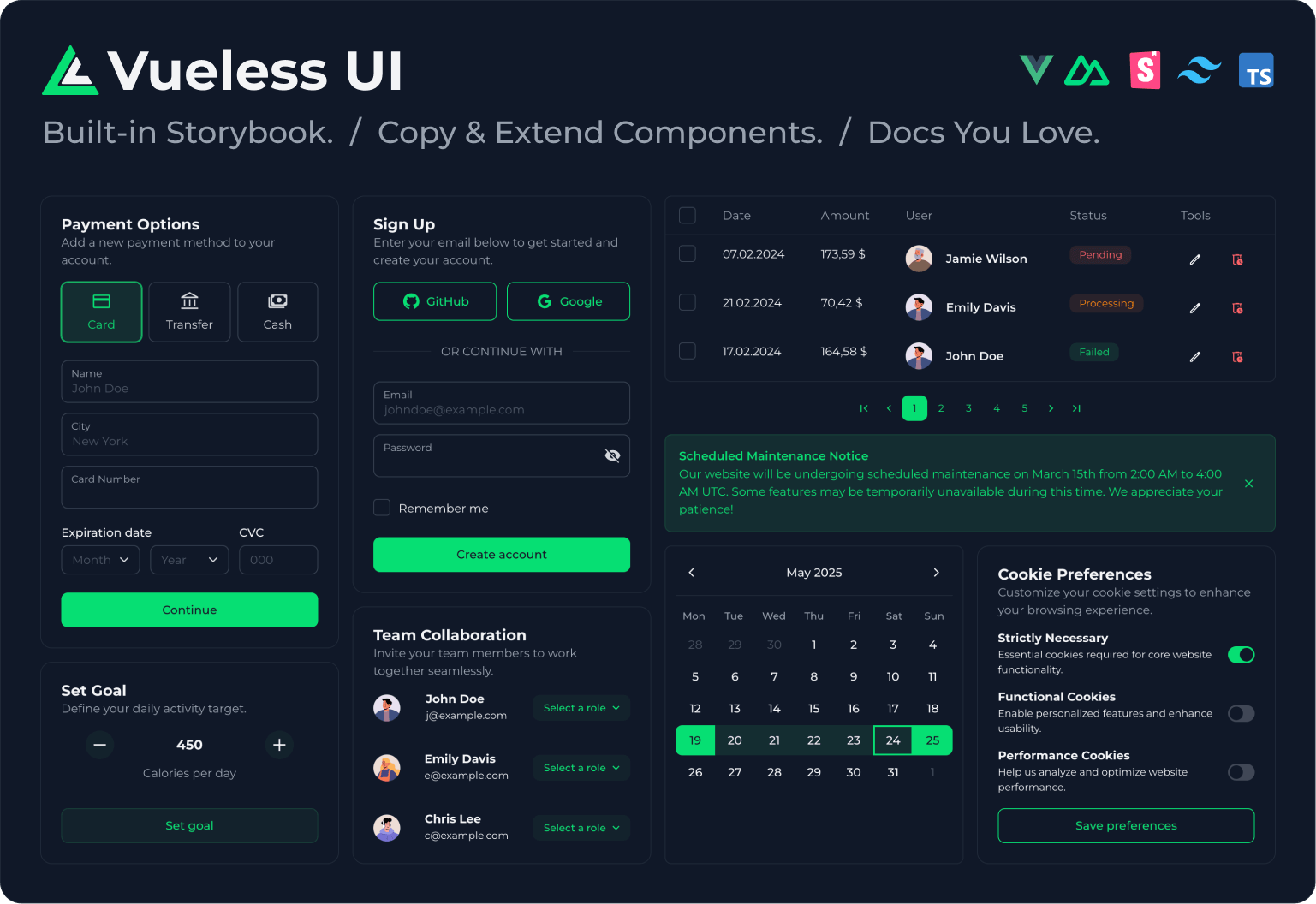
Vueless UI – a UI library with Open Architecture for Vue.js 3 and Nuxt.js 3 / 4, powered by [Storybook v10](https://storybook.js.org/) and [Tailwind CSS v4](https://tailwindcss.com/).
**With Vueless UI, you’re free to:**
* 🪄️ Customize any component
* 📋 Copy and extend existing ones
* 🧱 Build your own from scratch
* 📕 Document it all seamlessly in Storybook
### **Key features**
* 🧩 74 crafted UI components (including range date picker, multi-select, and nested table)
* ✨ Open Architecture lets you customize, copy, extend, and create your own components
* 📕 Built-in Storybook support ([docs](/installation/storybook))
* 🪩 Theme Builder for runtime theme customization ([open](https://my.vueless.com/))
* 🌈 Beautiful default UI theme
* 🌀 Unstyled mode
* 🌗 Light and dark mode
* 🧬 Design tokens powered by CSS variables
* ⚙️ Server-side rendering (SSR)
* 🌍 Internationalization (i18n)
* ♿️ Accessibility (a11y)
* 🖼️ Inline SVG icons
* 🪄 Auto component imports (as you use them)
* 🧿 Uncompiled source in npm for better DX
* 🧪️ 1600+ unit tests ensuring consistent logic
* 🛡️ Full TypeScript support with type safety
# Quick start (Vue)
## New project
To start using Vueless UI, run the following command:
{% tabs %}
{% tab title="npm" %}
```bash
npm create vueless@latest
```
{% endtab %}
{% tab title="yarn" %}
```bash
# For Yarn (v1+)
yarn create vueless
# For Yarn Modern (v2+)
yarn create vueless@latest
# For Yarn ^v4.11
yarn dlx create-vueless@latest
```
{% endtab %}
{% tab title="pnpm" %}
```bash
pnpm create vueless@latest
```
{% endtab %}
{% tab title="bun" %}
```bash
bun create vueless@latest
```
{% endtab %}
{% endtabs %}
This command guides you through a few setup options, then generates a new scaffolded Vue + Vueless UI project with the complete application structure.
## Existing project
1\. Install Vueless package.
{% tabs %}
{% tab title="npm" %}
```bash
npm install vueless
npx vueless init
```
{% endtab %}
{% tab title="yarn" %}
```bash
yarn add vueless
# For Yarn (v1+)
yarn vueless init --yarn
# For Yarn Modern (v2+)
yarn dlx vueless init --yarn
```
{% hint style="info" %}
Use the `--yarn` flag when working with Yarn 2+ or newer. This will generate a `.yarnrc.yml` file preconfigured with the necessary settings for the Vueless package.
{% endhint %}
{% endtab %}
{% tab title="pnpm" %}
```bash
pnpm add vueless
pnpm exec vueless init --pnpm
```
{% hint style="info" %}
Use the `--pnpm` flag when working with pnpm. This will generate a `.npmrc` file preconfigured with the necessary settings for the Vueless package.
{% endhint %}
{% endtab %}
{% tab title="bun" %}
```bash
bun add vueless
bunx vueless init
```
{% endtab %}
{% endtabs %}
2\. In the file where you create the Vue application, add the following code:
{% code title="main.{js,ts}" %}
```javascript
import { createApp } from 'vue';
import { createVueless } from "vueless";
import App from './App.vue';
const vueless = createVueless();
createApp(App).use(vueless).mount('#app');
```
{% endcode %}
3\. Import Tailwind CSS and Vueless at the top of the main CSS file.
{% code title="main.css" %}
```scss
@import "tailwindcss";
@import "vueless";
```
{% endcode %}
4\. Add Vite plugins.
{% code title="vite.config.{js,ts}" overflow="wrap" %}
```javascript
import { Vueless, TailwindCSS, UnpluginComponents } from "vueless/plugin-vite";
export default defineConfig({
plugins: [
...
Vueless(),
TailwindCSS(),
UnpluginComponents(),
],
...
});
```
{% endcode %}
That’s it! Vueless is now ready to use in your app ✨
# Quick start (Nuxt)
1\. Install Vueless Nuxt module.
{% tabs %}
{% tab title="npm" %}
```bash
npm install @vueless/nuxt
npx vueless init
```
{% endtab %}
{% tab title="yarn" %}
```bash
yarn add @vueless/nuxt
yarn vueless init --yarn
```
{% hint style="info" %}
Use the `--yarn` flag when working with Yarn 2+ or newer. This will generate a `.yarnrc.yml` file preconfigured with the necessary settings for the Vueless package.
{% endhint %}
{% endtab %}
{% tab title="pnpm" %}
```bash
pnpm add @vueless/nuxt
pnpm exec vueless init --pnpm
```
{% hint style="info" %}
Use the `--pnpm` flag when working with pnpm. This will generate a `.npmrc` file preconfigured with the necessary settings for the Vueless package.
{% endhint %}
{% endtab %}
{% tab title="bun" %}
```bash
bun add @vueless/nuxt
bunx vueless init
```
{% endtab %}
{% endtabs %}
2\. Register `@vueless/nuxt` into the Nuxt config `modules` section.
{% code title="nuxt.config.{js,ts}" %}
```javascript
export default defineNuxtConfig({
modules: [
'@vueless/nuxt'
],
...
})
```
{% endcode %}
3\. Import Tailwind CSS and Vueless at the top of the main CSS file.
{% code title="main.css" %}
```scss
@import "tailwindcss";
@import "vueless";
```
{% endcode %}
That’s it! Vueless is now ready to use in your app ✨
# Storybook
To work with components in a more easier way, use our preset for [Storybook](https://storybook.js.org/) to style and test components in isolation.
## Installation
1\. Install the package as a dev dependency and apply Vueless Storybook preset to the project.
{% tabs %}
{% tab title="npm" %}
```bash
npm install -D @vueless/storybook
npx @vueless/storybook init
```
{% endtab %}
{% tab title="yarn" %}
```bash
yarn add -D @vueless/storybook
yarn vueless-storybook init
```
{% endtab %}
{% tab title="pnpm" %}
```bash
pnpm add -D @vueless/storybook
pnpm exec @vueless/storybook init
```
{% endtab %}
{% tab title="bun" %}
```bash
bun add -D @vueless/storybook
bunx @vueless/storybook init
```
{% endtab %}
{% endtabs %}
Which:
* creates `.storybook` folder with all needed configuration in the project's root.
* adds commands into the project `package.json` to run and build Storybook locally.
{% hint style="info" %}
If the `.storybook` folder already exists, the command will back it up by renaming it to `.storybook-backup-{timestamp}`. You should migrate your custom configuration (if any) and remove the backup folder manually afterward.
{% endhint %}
2\. Run the Storybook ✨
```bash
npm run sb:dev
```
Other available commands:
```bash
# run Storybook in docs mode (same as seen on ui.vueless.com)
npm run sb:dev:docs
# build Storybook
npm run sb:build
# preview built Storybook locally
npm run sb:preview
```
## Hide unused components in Storybook
If you don’t plan to use certain Vueless components, you can hide them from Storybook by setting the component name key to `false` in the specific component’s config.
For example, if you don’t plan to use `UPagination` and `UBadge` in your project, you can configure them as follows:
{% code title="vueless.config.{js,ts}" %}
```js
export default {
components: {
UPagination: false,
UBadge: false,
},
};
```
{% endcode %}
Or, if you want to hide certain Vueless components while keeping their custom configs, set the `storybook` key to `false` in the specific component’s config.
{% code title="vueless.config.{js,ts}" %}
```js
export default {
components: {
UPagination: {
storybook: false,
...
},
UBadge: {
storybook: false,
...
},
},
};
```
{% endcode %}
# TypeScript
Vueless UI provides first-class TypeScript support, ensuring you get full type safety, autocompletion, and IntelliSense across your entire project.
## Vue and Nuxt
Add a reference to the Vueless module types in your project’s global type declarations:
{% code title="env.d.ts" %}
```typescript
///
```
{% endcode %}
Or define them directly in your `tsconfig.json`:
{% code title="tsconfig.json" %}
```json
{
"compilerOptions": {
...
"types": [
"vueless/modules",
]
},
}
```
{% endcode %}
## Vue
Add type declarations for components to provide prop autocompletion in IDEs.
{% code title="tsconfig.json" %}
```json
{
"include": [
...
"components.d.ts",
],
}
```
{% endcode %}
## Nuxt
Add this rule to override the default Nuxt TypeScript preset:
{% code title="tsconfig.json" %}
```json
{
"compilerOptions": {
...
"noUncheckedIndexedAccess": false,
}
}
```
{% endcode %}
# Class autocompletion
## IntelliSense
If you’re using VSCode or JetBrains IDEs (WebStorm, PHPStorm, etc.), you can set up class autocompletion.
**Benefits:**
* Autocompletion when typing in the `class` attribute.
* Autocompletion in objects by prefixing them with `/*tw*/` or `/* tw */`.
* Autocompletion inside the `config` prop.
**Example of an SFC with IntelliSense:**
```jsx
```
## VSCode
* Install [Tailwind CSS IntelliSense](https://marketplace.visualstudio.com/items?itemName=bradlc.vscode-tailwindcss) extension.
* Add the following extension configuration to your VSCode settings.
{% code title=".vscode/settings.json" %}
```json
{
"editor.quickSuggestions": {
"strings": true
},
"tailwindCSS.classAttributes": ["class", "config"],
"tailwindCSS.experimental.classRegex": [
["config:\\s*{([^)]*)\\s*}", "[\"'`]([^\"'`]*).*?[\"'`]"],
["/\\*tw\\*/\\s*{([^;]*)}", ":\\s*[\"'`]([^\"'`]*).*?[\"'`]"],
["/\\* tw \\*/\\s*{([^;]*)}", ":\\s*[\"'`]([^\"'`]*).*?[\"'`]"]
]
}
```
{% endcode %}
## JetBrains IDEs
* Ensure the [Tailwind CSS IntelliSense](https://www.jetbrains.com/help/webstorm/tailwind-css.html) extension is installed in your IDE. If it’s not, install it.
* Add the following extension configuration below in `Settings` > `Languages & Frameworks` > `Style Sheets` > `Tailwind CSS`.
```json
{
"suggestions": true,
"classAttributes": ["class", "config"],
"experimental": {
"classRegex": [
["config:\\s*{([^)]*)\\s*}", "[\"'`]([^\"'`]*).*?[\"'`]"],
["/\\*tw\\*/\\s*{([^;]*)}", ":\\s*[\"'`]([^\"'`]*).*?[\"'`]"]
]
}
}
```
# Minimal requirements
To meet the minimal requirements for Vueless, we recommend using:
* Node 20+
* Vite 5+
* Vue 3.5+ / Nuxt 3.13.1+
* TailwindCSS 4+
# General
To customize the look and feel of Vueless and modify the default library configuration, use the `vueless.config.{js,ts}` file, which should be placed in the root of your project.
***
## Colors
Components are based on a `primary` color and `neutral` color.
{% code title="vueless.config.{js,ts}" %}
```js
export default {
primary: "blue",
neutral: "stone",
};
```
{% endcode %}
Vueless uses Tailwind CSS under the hood, so you can use any of the [Tailwind CSS colors](https://tailwindcss.com/docs/customizing-colors#color-palette-reference) or your own custom colors. See [Colors](/global-customization/colors) chapter for more details.
***
## Rounding
Use the `rounding` key to simultaneously apply a border radius to all components.
{% code title="vueless.config.{js,ts}" %}
```js
export default {
rounding: 6, /* px */
};
```
{% endcode %}
See [Rounding](/global-customization/rounding) chapter for more details.
***
## Focus Outline
Use the `outline` key to simultaneously apply a focus outline ring to all components.
{% code title="vueless.config.{js,ts}" %}
```js
export default {
outline: 4, /* px */
};
```
{% endcode %}
See [Focus Outline](#focus-outline) chapter for more details.
***
## Font Size
Use the `fontSize` key to simultaneously apply a font size to all components.
{% code title="vueless.config.{js,ts}" %}
```js
export default {
fontSize: 16, /* px */
};
```
{% endcode %}
See [Font Size](/global-customization/font-size) chapter for more details.
***
## Letter Spacing
Use the `letterSpacing` key to simultaneously apply letter spacing to all components.
{% code title="vueless.config.{js,ts}" %}
```js
export default {
letterSpacing: 0.025, /* em */
};
```
{% endcode %}
See [Letter Spacing](/global-customization/letter-spacing) chapter for more details.
## Disabled Opacity
You can set the components disabled state opacity globally for related Vueless components.
{% code title="vueless.config.{js,ts}" %}
```js
export default {
disabledOpacity: 40, /* percent, % */
};
```
{% endcode %}
See [Disabled Opacity ](/global-customization/disabled-opacity)chapter for more details.
***
## Dark mode
Use the `colorMode` key to define dark / light modes for all components.
{% code title="vueless.config.{js,ts}" %}
```js
export default {
colorMode: "dark", /* dark | light | auto */
};
```
{% endcode %}
See [Dark mode](/global-customization/dark-mode) chapter for more details.
***
## Cookie Prefix
Theme values are stored in cookies for SSR. Browsers scope cookies by host but not by port, so apps served from the same host (for example, several apps on `localhost`) would share them. To keep them separate, Vueless prefixes theme cookie names with your `package.json` name (`@acme/back-office` becomes `acme-back-office-vl-color-mode`). No configuration is needed.
Use the `cookiePrefix` key to override the prefix, or set it to an empty string to disable prefixing.
{% code title="vueless.config.{js,ts}" %}
```js
export default {
cookiePrefix: "app-a",
};
```
{% endcode %}
Local storage keys are never prefixed, because local storage is already separate per origin. On the client Vueless reads theme values from local storage; the cookies exist so SSR apps can read them and pass them to `getTheme()`.
# Colors
## Predefined colors
Components are based on a `primary` color and `neutral` color.
{% code title="vueless.config.{js,ts}" %}
```js
export default {
primary: "green", /* default -> grayscale */
neutral: "stone", /* default -> gray */
};
```
{% endcode %}
Vueless uses Tailwind CSS under the hood, so you can use any of the [Tailwind CSS colors](https://tailwindcss.com/docs/customizing-colors#color-palette-reference) or your own custom colors.
#### Default primary colors:
`red`, `orange`, `amber`, `yellow`, `lime`, `green`, `emerald`, `teal`, `cyan`, `sky`, `blue`, `indigo`, `violet`, `purple`, `fuchsia`, `pink`, `rose`
#### Default neutral colors:
`slate`, `gray`, `zinc`, `neutral`, `stone`, `mauve`, `olive`, `mist`, `taupe`
***
## Custom color shades
You can also define custom colors by providing an object with all Tailwind shades (`50`, `100` ..., `950`):
{% code title="vueless.config.{js,ts}" %}
```js
export default {
primary: {
50: "#fef2f2",
100: "#fee2e2",
200: "#fecaca",
300: "#fca5a5",
400: "#f87171",
500: "#ef4444",
600: "#dc2626",
700: "#b91c1c",
800: "#991b1b",
900: "#7f1d1d",
950: "#450a0a",
},
neutral: {
50: "#f9fafb",
100: "#f3f4f6",
200: "#e5e7eb",
300: "#d1d5db",
400: "#9ca3af",
500: "#6b7280",
600: "#4b5563",
700: "#374151",
800: "#1f2937",
900: "#111827",
950: "#030712",
},
};
```
{% endcode %}
{% hint style="info" %}
If you use an object for colors, all shade keys should be defined. Missing or invalid shade keys will trigger a console warning.
{% endhint %}
***
## CSS variables
To enable dynamic color changes at runtime, Vueless use the `--vl-primary-*` and `--vl-neutral-*` CSS variables. These variables will represent all Tailwind CSS shades of the defined Vueless colors.
* `--vl-primary-50`, `--vl-primary-100`, ... `--vl-primary-900`, `--vl-primary-950`
* `--vl-gray-50`, `--vl-gray-100`, ... `--vl-gray-900`, `--vl-gray-950`
Example usage ([custom properties syntax](https://tailwindcss.com/docs/color#using-a-custom-value)):
```html
```
***
## Adding color utility classes
To use all `primary` and `neutral` color shades as a utility classes (e.g.: `text-primary-700 dark:text-neutral-300`), you must define them in the application’s main CSS file.
{% code title="main.css" %}
```scss
@import "tailwindcss";
@import "vueless";
@theme {
/* Primary colors */
--color-primary-50: var(--vl-primary-50);
--color-primary-100: var(--vl-primary-100);
--color-primary-200: var(--vl-primary-200);
--color-primary-300: var(--vl-primary-300);
--color-primary-400: var(--vl-primary-400);
--color-primary-500: var(--vl-primary-500);
--color-primary-600: var(--vl-primary-600);
--color-primary-700: var(--vl-primary-700);
--color-primary-800: var(--vl-primary-800);
--color-primary-900: var(--vl-primary-900);
--color-primary-950: var(--vl-primary-950);
/* Neutral colors */
--color-neutral-50: var(--vl-neutral-50);
--color-neutral-100: var(--vl-neutral-100);
--color-neutral-200: var(--vl-neutral-200);
--color-neutral-300: var(--vl-neutral-300);
--color-neutral-400: var(--vl-neutral-400);
--color-neutral-500: var(--vl-neutral-500);
--color-neutral-600: var(--vl-neutral-600);
--color-neutral-700: var(--vl-neutral-700);
--color-neutral-800: var(--vl-neutral-800);
--color-neutral-900: var(--vl-neutral-900);
--color-neutral-950: var(--vl-neutral-950);
}
```
{% endcode %}
{% hint style="info" %}
Keep in mind that Tailwind CSS already includes a neutral color in its palette, so it will be overridden. To avoid conflicts, consider using a different color name, such as `neu` (e.g., `--color-neu-*`).
{% endhint %}
***
## Custom colors
When [overriding default colors](https://tailwindcss.com/docs/colors#overriding-default-colors) or [adding custom colors](https://tailwindcss.com/docs/colors#customizing-your-colors), ensure you define all shades from 50 to 950, or at least the ones used in the default or your Vueless theme.
{% code title="main.css" %}
```scss
@import "tailwindcss";
@import "vueless";
@theme {
/* Custom blue colors */
--color-blue-50: #f1f9fe;
--color-blue-100: #e1f3fd;
--color-blue-200: #bde6fa;
--color-blue-300: #62c8f4;
--color-blue-400: #41beef;
--color-blue-500: #18a5df;
--color-blue-600: #0b85be;
--color-blue-700: #0a6a9a;
--color-blue-800: #0d597f;
--color-blue-900: #104b6a;
--color-blue-950: #0b2f46;
}
```
{% endcode %}
You can generate your colors using tools such as [uicolors](https://uicolors.app) for example.
# Design system
Vueless enhances Tailwind CSS theming with a flexible design system, featuring pre-configured color aliases and CSS variables. This enables seamless customization and effortless UI adaptation to match your brand’s aesthetic.
## Colors
Vueless uses the Vueless config to define customizable color aliases based on [Tailwind CSS colors](http://tailwindcss.com/docs/colors#color-palette-reference).
Color
Default
Description
neutral
gray
Regular neutral color.
grayscale
gray
Contrasted neutral color.
primary
grayscale (alias)
The primary color, used as the default for components.
secondary
gray
A secondary color that complements the primary color.
success
green
A color used for success states.
error
red
A color used for danger states or form error validation.
warning
orange
A color used for warning states.
notice
violet
A color used for highlighted informational states.
info
blue
A color used for informational states.
## Tokens
Vueless uses 40+ CSS variables as design tokens to ensure consistent and flexible component styling. These tokens form the foundation of the theming system, providing seamless support for `light` and `dark` modes. Applied across all components, they can be customized through the Vueless config.
### Color Shades
Vueless automatically generates three CSS variables and defines custom Tailwind CSS color utilities for each color alias.
Here’s an example of an `error` color:
You can use this colors as an CSS variable in a utility class directly `text-(--vl-text-muted)`.
#### Border neutral colors
CSS variable
Tailwind CSS utility class
Description
--vl-border-muted
border-muted
Lighter border (e.g., for disabled states).
--vl-border
border-default
Default border.
--vl-border-lifted
border-lifted
Darker border (e.g., for hover states).
--vl-border-accented
border-accented
Darkest border (e.g., for active states).
You can use this colors as an CSS variable in a utility class directly `border-(--vl-border-accented)`.
#### Background neutral colors
CSS variable
Tailwind CSS utility class
Description
--vl-bg
bg-default
Unfilled background.
--vl-bg-muted
bg-muted
Slightly filled background.
--vl-bg-lifted
bg-lifted
Filled background.
--vl-bg-accented
bg-accented
Pretty filled background.
--vl-bg-inverted
bg-inverted
Contrast background.
You can use this colors as an CSS variable in a utility class directly `bg-(--vl-bg-muted)`.
## Redefining colors
You can use the following color types as color value: `CSS variable` (or just their name), `HEX`, `RGB`, `RGBA`, `HSL`, `HSLA` and `OKLCH`.
{% tabs %}
{% tab title="in Config" %}
{% code title="vueless.config.{js,ts}" %}
```javascript
export default {
lightTheme: {
"--vl-primary": "--vl-primary-600", // css variable name
"--vl-primary-lifted": "var(--vl-primary-700)", // css variable
"--vl-primary-accented": "#0d597f", // hex
},
darkTheme: {
"--vl-primary": "rgba(65, 190, 239, 1)", // rgba
"--vl-primary-lifted": "hsl(197, 81%, 48%)", // hsl
"--vl-primary-accented": "oklch(0.59 0.1273 237.97)", // oklch
},
};
```
{% endcode %}
{% endtab %}
{% tab title="in CSS" %}
{% code title="main.css" %}
```css
:root {
--vl-primary: var(--vl-primary-600); /* css variable */
--vl-primary-lifted: var(--vl-primary-700); /* css variable */
--vl-primary-accented: #0d597f; /* hex */
}
.vl-dark {
--vl-primary: rgba(65, 190, 239, 1); /* rgba */
--vl-primary-lifted: hsl(197, 81%, 48%); /* hsl */
--vl-primary-accented: oklch(0.59 0.1273 237.97); /* oklch */
}
```
{% endcode %}
{% endtab %}
{% endtabs %}
## Component colors restriction
Some components — such as `UAvatar`, `UButton`, `ULink` ... — include a `color` prop with a predefined list of available colors. To globally customize this list (either by restricting or extending it), use the `colors` configuration key.
{% code title="vueless.config.{js,ts}" %}
```js
export default {
colors: ["success", "error", "primary"],
}
```
{% endcode %}
## Runtime color switching
If you want to allow users to switch `primary` or `neutral` colors at runtime, define them using the `runtimeColors` configuration key. It can be set to either an array of color names or `true` to enable all supported colors. Vueless automatically safelists CSS variables for all Tailwind color shades to [support this functionality](/helpers/change-settings-in-runtime).
{% code title="vueless.config.{js,ts}" %}
```js
export default {
runtimeColors: ["amber", "rose", "fuchsia", "teal"],
/* OR */
runtimeColors: true,
}
```
{% endcode %}
# Rounding
You can set three sizes of border radiuses globally for all Vueless components.
{% code title="vueless.config.{js,ts}" %}
```js
export default {
rounding: 6, /* default -> 8 (pixels) */
};
```
{% endcode %}
You can set any border-radius value in pixels, but we highly recommend adhering to [Tailwind CSS’s predefined border-radius](https://tailwindcss.com/docs/border-radius) values for consistency.
If you define only the `rounding` (`medium`) value, `small` and `large` sizes will be automatically calculated. The expected values are listed in the table below:
| small (rounding.sm) | medium (rounding / rounding.md) | large (rounding.lg) |
| ------------------- | ------------------------------- | ------------------- |
| 0 | **0** | 2 |
| 0 | **2** | 8 |
| 2 | **4** | 10 |
| 4 | **6** | 12 |
| 4 | **8** | 14 |
| 6 | 1**0** | 16 |
| 8 | **12** | 18 |
| 10 | 1**4** | 20 |
| 12 | **16** | 22 |
{% hint style="info" %}
In the config, values are specified in `pixels` for simplicity, but they are automatically converted into `rem` under the hood.
{% endhint %}
If you want to use custom values for `small` and `large` roundings, you can define them manually.
{% code title="vueless.config.{js,ts}" %}
```js
export default {
rounding: {
sm: 5,
md: 6,
lg: 7,
}
};
```
{% endcode %}
## Custom tailwind class
To implement global border radius stylings, Vueless provides custom Tailwind CSS classes and corresponding CSS variables. Feel free to use these classes in your components whenever you need consistent rounding across your project.
You can also use the corresponding CSS variables directly:
| Custom classes | CSS variables in a utility class |
| ---------------- | -------------------------------- |
| `rounded-small` | `rounded-(--vl-rounding-sm)` |
| `rounded-medium` | `rounded-(--vl-rounding)` |
| `rounded-large` | `rounded-(--vl-rounding-lg)` |
# Focus Outline
You can set the focus outline width globally for all Vueless components.
{% code title="vueless.config.{js,ts}" %}
```js
export default {
outline: 4, /* default -> 2 (pixels) */
};
```
{% endcode %}
If you define only the `outline` (`medium`) value, `small` and `large` sizes will be automatically calculated. The expected values are listed in the table below:
| small (outline.sm) | medium (outline / outline.md) | large (outline.lg) |
| ------------------ | ----------------------------- | ------------------ |
| 0 | **0** | 0 |
| 0 | **1** | 2 |
| 1 | **2** | 3 |
| 2 | **3** | 4 |
| 3 | **4** | 5 |
| 4 | **5** | 6 |
| 5 | **6** | 7 |
If you want to use custom values for `small` and `large` outlines, you can define them manually.
{% code title="vueless.config.{js,ts}" %}
```js
export default {
outline: {
sm: 2,
md: 4,
lg: 6,
}
};
```
{% endcode %}
## Custom tailwind class
To implement global focus ring stylings, Vueless provides custom Tailwind CSS classes and corresponding CSS variables. Feel free to use these classes in your components whenever you need consistent rounding across your project.
You can also use the corresponding CSS variables directly:
| Custom classes | CSS variables in a utility class |
| ---------------- | -------------------------------- |
| `outline-small` | `outline-(--vl-outline-sm)` |
| `outline-medium` | `outline-(--vl-outline)` |
| `outline-large` | `outline-(--vl-outline-lg)` |
# Font Size
You can set the components font size globally for all Vueless components.
{% code title="vueless.config.{js,ts}" %}
```js
export default {
text: 16, /* default -> 14 (pixels) */
};
```
{% endcode %}
If you define only the `text` (`medium`) value, `tiny`, `small` and `large` sizes will be automatically calculated. The expected values are listed in the table below:
| tiny (text.xs) | small (text.sm) | medium (text / text.md) | large (text.lg) |
| -------------- | --------------- | ----------------------- | --------------- |
| 8 | 10 | **12** | 14 |
| 9 | 11 | **13** | 15 |
| 10 | 12 | **14** | 16 |
| 11 | 13 | **15** | 17 |
| 12 | 14 | **16** | 18 |
If you want to use custom values for `tiny`, `small` and `large` font-sizes, you can define them manually.
{% code title="vueless.config.{js,ts}" %}
```js
export default {
text: {
xs: 12,
sm: 13,
md: 14,
lg: 15,
}
};
```
{% endcode %}
## Custom tailwind class
To implement global font size stylings, Vueless provides custom Tailwind CSS classes and corresponding CSS variables. Feel free to use these classes in your components whenever you need consistent rounding across your project.
You can also use the corresponding CSS variables directly:
| Custom classes | CSS variables in a utility class |
| -------------- | -------------------------------- |
| `text-tiny` | `text-(--vl-text-xs)` |
| `text-small` | `text-(--vl-text-sm)` |
| `text-medium` | `text-(--vl-text)` |
| `text-large` | `text-(--vl-text-lg)` |
# Disabled Opacity
You can set the components disabled state opacity globally for related Vueless components.
{% code title="vueless.config.{js,ts}" %}
```js
export default {
disabledOpacity: 40, /* default -> 50 (percent, %) */
};
```
{% endcode %}
## Custom CSS variable
To implement global disabled state opacity stylings, Vueless provides custom CSS variable. Feel free to use it in your components whenever you need consistent opacity for disabled state across your project.
The variable: `--vl-disabled-opacity`
# Letter Spacing
You can set global letter spacing that will be inherited by all text content.
{% code title="vueless.config.{js,ts}" %}
```js
export default {
letterSpacing: 0.025, /* default -> 0 (em) */
};
```
{% endcode %}
You can set any letter-spacing value in `em` units. We recommend using values between `-0.05em` and `0.1em` for optimal readability.
## Custom CSS variable
To implement letter spacing stylings, Vueless provides custom CSS variable, which applies directly to the `body` element. Feel free to use it in your components whenever you need consistent letter spacing across your project (if letter spacing for body will be overridden).
The variable: `--vl-letter-spacing`
# Dark mode
You can set the dark mode globally for all Vueless components.
{% code title="vueless.config.{js,ts}" %}
```js
export default {
colorMode: "dark", /* default -> auto */
};
```
{% endcode %}
### Possible color mode values:
* `dark`: Enables dark mode. Adds the class `vl-dark` to the `` tag.
* `light`: Disables dark mode. Adds the class `vl-light` to the `` tag.
* `auto` (default): Adapts to the user’s system settings for dark mode. Automatically adds the appropriate class (`vl-dark` or `vl-light`) to the `` tag based on the user’s preference.
# Custom tailwind classes
To prevent class duplication, Vueless uses [tailwind-merge](https://github.com/dcastil/tailwind-merge) under the hood.
If you plan to use custom Tailwind CSS classes to style Vueless components, add them to the Vueless config under the `tailwindMerge` key, following the `tailwind-merge` configuration.
See the full list of available properties [here](https://github.com/dcastil/tailwind-merge/blob/main/src/lib/default-config.ts).
{% code title="vueless.config.js" %}
```js
export default {
tailwindMerge: {
extend: {
theme: {
classGroups: {
"ring-w": [{ ring: ["tiny"] }],
"font-size": [{ text: ["2xs"] }],
}
}
}
}
};
```
{% endcode %}
# General
Vueless gathers all component settings in one place — a plain JavaScript object. This includes styles, default prop values, i18n, and more.
{% hint style="info" %}
You can find component default settings in the “Default Config” section at the end of each component docs page in the [Vueless UI documentation](https://ui.vueless.com/).
{% endhint %}
The default Vueless component configs can be customized globally under the `component` key in the`vueless.config.{js,ts}`.
## Usage
Here is an example of customizing the `USelect` component. In this example, we partially redefine some styles (Tailwind CSS classes), internationalization values, and default props.
{% code title="vueless.config.{js,ts}" %}
```js
export default {
component: {
USelect: {
wrapper: "border-brand-400 w-64",
selectedLabel: "text-lg font-bold px-4",
i18n: {
clear: "Remove",
addMore: "Add item",
},
defaults: {
size: "lg",
clearable: false,
dropdownIcon: "arrow_down",
},
}
}
};
```
{% endcode %}
## Inspecting config keys
To enhance the developer experience, the component name and config key are displayed in the browser console (dev environment only) under the attributes `vl-component` and `vl-key.`
For components with nested components, two additional attributes, `vl-child-component` and `vl-child-key`, indicate the nested component and its corresponding config key.
Learn more how to [style nested components](/component-customization/nested-components-styling).
# Styling
The library uses [Tailwind CSS](https://tailwindcss.com/) as its CSS framework for component styling. To conditionally apply styles based on prop values, Vueless leverages [CVA](https://beta.cva.style) (Class Variance Authority).
Each HTML tag in a component has its own config key with corresponding Tailwind classes inside.
### **The component styles can be customized in three ways:**
* Globally for particular component in `vueless.config.{js,ts}`
* Locally using the component’s `config` prop.
* Locally using the component’s `class` attribute.
### Merging priority
Thanks to [tailwind-merge](https://github.com/dcastil/tailwind-merge), all those configs are smartly merged with the component's default config, following this priority order:
* Component `class` attribute (highest priority)
* Component `config` prop
* Global `vueless.config.{js,ts}`
* Component default config (lowest priority)
## Component global styling
To apply your project’s design system styles to Vueless components, define them under the `component` key in the `vueless.config.{js,ts}` file. Use the component name (e.g., `UButton`, `UCard`, etc.) as a nested key, and assign class names to relevant parts of the component within its config.
{% hint style="success" %}
This is the recommended way for styling Vueless components.
{% endhint %}
Example of component customization:
{% code title="vueless.config.{js,ts}" %}
```js
export default {
component: {
UButton: {
button: "bg-red-500",
text: "px-4 text-2xl font-bold",
},
UCard: {
wrapper: "border-gray-300",
}
}
};
```
{% endcode %}
## Component config prop
Each component includes a config prop that allows for specific customization. Use this approach to fine-tune components for particular cases.
{% hint style="warning" %}
Use this approach with caution to ensure the project's design system remains consistent.
{% endhint %}
For example, to change the font weight of the `title`, you only need to specify:
```html
```
This will smartly replace `font-medium` with `font-bold`, avoiding class duplication and preventing any class priority issues.
## Component class attribute
You can also use the default `class` attribute to add classes to the component.
```html
```
In this case, the classes will be applied to the top-level component’s HTML tag and will override any other classes applied at lower levels (config prop, vueless config and component default config).
{% hint style="info" %}
This approach is best suited for component positioning.
{% endhint %}
# Unstyled mode
To completely remove Vueless default styles and use only your custom ones, set the `unstyled` key in `vueless.config.{js,ts}` globally, or individually within specific components.
{% code title="vueless.config.{js,ts}" %}
```js
export default {
unstyled: true, /* remove defalut styles for all components */
component: {
UButton: {
unstyled: false, /* but keep default styles for the UButton component */
button: {
base: "text-2xl absolute",
}
}
}
};
```
{% endcode %}
# Conditional styling
To apply styles conditionally, you can use the `base`, `variants` and `compoundVariants` keys inside the corresponding component’s config element key.
## Base
Allows you to apply classes consistently, reducing code duplication in `variants` and `compoundVariants`.
## Variants
Allows you to conditionally apply classes based on **individual** prop values. There is no limit to the number of variants you can define.
{% code title="vueless.config.{js,ts}" %}
```js
export default {
component: {
UBadge: {
badge: {
/* base classes */
base: "border",
variants: {
/* string variant */
size: {
sm: "px-2 text-2xs",
md: "px-2.5 text-xs",
lg: "px-3 text-sm",
},
/* boolean variant */
round: {
true: "rounded-full",
false: "rounded-dynamic",
},
},
},
}
}
};
```
{% endcode %}
## Compound Variants
Sometimes you might want to add a variant that depends on another variant. For example, you might want to add a `color` variant that depends on the `disabled` variant. This is possible by using the `compoundVariants` key.
There is no limit to the number of compound variants and props inside you can define.
{% code title="vueless.config.{js,ts}" %}
```js
export default {
component: {
UBadge: {
badge: {
base: "border",
compoundVariants: [
/*
* Regular compound variant.
*/
{
color: "white",
variant: "primary",
class: "bg-white text-gray-900",
},
/*
* Compound variant with boolean value.
*/
{
color: "white",
variant: "primary",
disabled: true,
class: "bg-gray-200 text-gray-600",
},
/*
* Grouped compound variant.
* Applies classes for both "white" and "grayscale" color values.
*/
{
color: ["white", "grayscale"],
variant: "primary",
class: "ring-gray-700",
},
],
},
}
}
};
```
{% endcode %}
{% hint style="info" %}
Note that the `compoundVariants` key always is an **array** of objects.
{% endhint %}
# Extends styling from keys
To minimize code duplication, you can extend classes from another key using the extends notation: `{>keyName}`.
## Multiple extensions
It’s possible to extend multiple keys within a single key, including those that already extends from other keys (nested extends). Classes are automatically will be merged based on the order of the keys, with the last keys taking higher priority.
## Conditional styling extensions
The key you extend can also include conditional styling configurations, such as `variants` and `compoundVariants`. Classes are fully resolved before extension and then merged with the key where the extension is applied.
{% hint style="warning" %}
For this particular case, extension is limited to a single key.
{% endhint %}
# Nested components styling
In some component default config (e.g. `UTable`), you might find other component names enclosed in curly brackets, such as `{UButton}`, `{UIcon}`, `{ULink}`, etc. This indicates that the component key contains this nested Vueless component.
{% code title="UTable default config" %}
```js
export default {
/* Shortcut notation */
headerLoader: "{ULoaderProgress} ...",
/* Full notation */
bodyCellNestedExpandIcon: {
base: "{UIcon}",
...
},
};
```
{% endcode %}
The styles of these nested components can be customized by defining their config keys within the parent component’s config key (including conditional styling as well).
{% code title="vueless.config.{js,ts}" %}
```js
export default {
component: {
UTable: {
/* Redefining top-level component's element classes (shortcut). */
headerLoader: "absolute !top-auto",
/* Redefining classes for any component's nested elements. */
bodyCellNestedExpandIcon: {
wrapper: "rounded-sm",
container: "bg-gray-200",
},
}
}
};
```
{% endcode %}
# Props defaults
Component props such as `size`, `color`, `variant`, etc., have default values that can be overridden in the project's `vueless.config.{js,ts}`.
## Nested component defaults
The `config` prop can also be used to redefine default prop values. In practice, this is useful for changing default values of nested components.
In the example above, we redefine the default values for the nested `UButton` component within the parent `UPagination` component.
## Conditional default values
If you need to set default values for nested components based on the parent component’s prop value, you can use an object with mapped values.
This will conditionally set the size for the `UDropdownList` component based on the size value of the `UDropdownButton` component.
For example, if the UDropdownButton’s size prop is set to `"2xs"`, the UDropdownList component will automatically receive a size value of `"sm"`.
# Redefining props
Sometimes, you might need to limit possible prop values, add new ones, or hide certain props in Storybook documentation. To achieve this, you can redefine prop settings using the `props` key in the component’s config.
{% code title="vueless.config.{js,ts}" %}
```js
export default {
component: {
UButton: {
props: {
/*
* Restrict color values to a provided list of items.
* Use this to align the prop entirely with the design system.
*/
color: {
values: ["blue", "green", "yellow", "brand"],
},
/*
* Add a new, previously non-existent value, `liquid-glass`.
* Use this to fully align the prop with the design system.
* For examle, if the design system includes variant not present in Vueless.
*/
variant: {
values: ["solid", "outline", "subtle", "soft", "ghost", "liquid-glass"],
},
/*
* Hide the prop in Storybook.
* For example, if the design system lacks related styles
* and the prop serves no purpose.
*/
filled: {
ignore: true,
}
}
}
}
};
```
{% endcode %}
# Defining custom props
If existing props don’t support the conditional styling you need, you can add custom props and use them in `variants` or `compoundVariants` as needed.
{% code title="vueless.config.{js,ts}" %}
```js
export default {
component: {
UButton: {
props: {
/*
* Boolean prop example.
*/
featured: {
type: "boolean",
required: false,
description: "Set button featured."
},
/*
* Enum (string) prop example.
*/
shape: {
type: "string",
values: ["circle", "parallelogram", "square"],
default: "square",
required: true,
description: "Set button shape."
}
}
}
}
};
```
{% endcode %}
### Prop settings
key
default
Description
type
"string"
Supported values: "string", "number", "boolean".
values
[]
Limits possible prop values (union type in TS).
default
""
Defines default value.
required
false
Makes props required.
description
""
Adds props description in Storybook docs.
ignore
false
Hides prop in Storybook docs.
{% hint style="info" %}
All key are optional.
{% endhint %}
# Internationalization (i18n)
You can specify locale messages and a default locale for Vueless components. Additionally, you can integrate the package with [vue-i18n](https://vue-i18n.intlify.dev/).
## Defining locales
Vueless supports only the English locale by default. To add additional locales, you can provide them in the `createVueless()` function under the `i18n` key, using the structure shown below.
The full list of locale keys available in Vueless UI can be found in the Default Config chapter of the [Vueless UI docs](https://ui.vueless.com/), at the end of each page.
{% tabs %}
{% tab title="Vue-i18n" %}
To integrate the [`vue-i18n`](https://vue-i18n.intlify.dev/) library with Vueless components, use the `createVueI18nAdapter()` function. This will allow Vueless components to work seamlessly with the [`vue-i18n`](https://vue-i18n.intlify.dev/) package for localization.
{% code title="main.{js,ts}" %}
```javascript
import { createVueless, defaultEnLocale, createVueI18nAdapter } from "vueless";
import { createI18n } from "vue-i18n";
const i18n = createI18n({
legacy: false, // legacy mode should be disabled
locale: "ua", // default locale
fallback: "en", // fallback locale
messages: {
en: { // customize or overwrite default english locale
...defaultEnLocale,
USelect: { // Vueless component name
listIsEmpty: "List is empty.",
noDataToShow: "No data to show.",
clear: "clear",
addMore: "Add more...",
},
// other project messages
projectMessageOne: "Hello wrold!",
projectMessageTwo: "Brave new world.",
},
ua: { // new custom locale
USelect: { // Vueless component name
listIsEmpty: "Список порожній.",
noDataToShow: "Дані відсутні.",
clear: "очистити",
addMore: "Додати ще...",
},
// other project messages
projectMessageOne: "Привіт світ!",
projectMessageTwo: "Прекрасний новий світ.",
},
},
});
const vueless = createVueless({
i18n: {
adapter: createVueI18nAdapter(i18n),
},
});
```
{% endcode %}
{% endtab %}
{% tab title="Vueless-i18n" %}
Vueless provides minimal built-in support for internationalization (i18n) out of the box. However, we strongly recommend using [`vue-i18n`](https://vue-i18n.intlify.dev/) alongside `vueless-i18n` to take full advantage of advanced i18n features.
{% code title="main.{js,ts}" %}
```javascript
import { createVueless, defaultEnLocale } from "vueless";
const vueless = createVueless({
i18n: {
locale: "en", // default locale
fallback: "en", // fallback locale
messages: {
en: { // customize or overwrite default english locale
...defaultEnLocale,
USelect: { // Vueless component name
listIsEmpty: "List is empty.",
noDataToShow: "No data to show.",
clear: "clear",
addMore: "Add more...",
},
},
ua: { // new custom locale
USelect: { // Vueless component name
listIsEmpty: "Список порожній.",
noDataToShow: "Дані відсутні.",
clear: "очистити",
addMore: "Додати ще...",
},
},
},
},
});
```
{% endcode %}
{% endtab %}
{% tab title="Nuxt i18n" %}
The built-in internationalization support in Vueless works fine with Nuxt. However, you will need to use the [Nuxt I18n module](https://i18n.nuxtjs.org/) for more advanced features like route localization.\
\
Run to install Nuxt i18n:
```bash
npx nuxi@latest module add @nuxtjs/i18n
```
You can extend and overwrite [locales](https://i18n.nuxtjs.org/docs/getting-started/usage) in locales directory.
```json
locales/en.json
{
"USelect": {
"listIsEmpty": "List is empty.",
"noDataToShow": "No data to show.",
"clear": "clear",
"addMore": "Add more..."
},
"projectMessageOne": "Hello wrold!",
"projectMessageTwo": "Brave new world."
}
```
{% endtab %}
{% endtabs %}
## Changing current locale
If you’re using [`vue-i18n`](https://vue-i18n.intlify.dev/), you can change the current locale using the provided `useI18n` composable. However, if you want to change the locale without[`vue-i18n`](https://vue-i18n.intlify.dev/), you can use the `useLocale` composable provided by Vueless. This composable allows you to manage the locale directly within the Vueless library.
{% tabs %}
{% tab title=" Vue-i18n" %}
```html
```
{% endtab %}
{% tab title=" Vueless-i18n" %}
```html
```
{% endtab %}
{% tab title="Nuxt i18n" %}
```html
```
{% endtab %}
{% endtabs %}
## Customizing messages in specific component
You can easily set custom messages for a specific component by providing the `i18n` key in the component’s config.
```html
```
# Vueless file structure
All Vueless components follow a consistent file structure. We recommend adopting this structure when creating your own local components to ensure maintainability and consistency.
{% tabs %}
{% tab title="File structure" %}
```bash
U[component]/
├─ storybook/
│ ├─ docs.mdx
│ └─ stories.ts
├─ tests/
│ ├─ U[component].test.ts
│ ├─ util[service].test.ts
│ ├─ use[composable].test.ts
│ └─ ... # rest tests
├─ config.ts
├─ constants.ts
├─ types.ts
├─ U[component].vue
│ # optional
├─ U[component][child].vue
├─ ... # rest child components
├─ use[composable].ts
├─ ... # rest composable
├─ util[service].ts
└─ ... # rest utils
```
{% endtab %}
{% tab title="Example" %}
```bash
ui.form-date-picker-range/
├─ storybook/
│ ├─ docs.mdx
│ └─ stories.ts
├─ tests/
│ ├─ UDatePickerRange.test.ts
│ ├─ UDatePickerRangeInputs.test.ts
│ ├─ UDatePickerRangePeriodMenu.test.ts
│ └─ ... # rest tests
├─ config.ts
├─ constants.ts
├─ types.ts
├─ UDatePickerRange.vue
├─ UDatePickerRangeInputs.vue
├─ UDatePickerRangePeriodMenu.vue
├─ useLocale.ts
├─ useUserFormat.ts
├─ utilDateRange.ts
└─ utilValidation.ts
```
{% endtab %}
{% endtabs %}
### 📁 U\[component]/
Each component should be contained within a single folder, maintaining a flat file structure. All component names must be prefixed with `U` to ensure proper recognition by Vueless.
### 📁 storybook/
Folder for Storybook-related files:
* 📜 docs.mdx – component docs page.
* 📜 stories.ts – component stories.
### 📁 tests/
Folder for test-related files:
* 📜 U\[component].test.ts – component tests.
* 📜 util\[service].test.ts – component utility service tests. (optional)
* 📜 use\[composable].test.ts – component composable tests. (optional)
We recommend using `vitest` with `@vue/test-utils` for testing
### 📜 config.ts
Contains all styles, default prop values, internationalization (i18n), and other component-specific settings.
### 📜 constants.ts
Contains component constants.
### 📜 types.ts
Contains component types and props declaration.
### 📜 U\[component].vue
Parent Vue component.
### 📜 U\[component]\[child].vue (optional)
A child Vue component used within the parent component. The parent component may have multiple child components, all prefixed with the parent component’s name.
Example: `UButtonIcon.vue` (child of `UButton.vue`).
### 📜 use\[composable].ts (optional)
Composables specific to the component. A component may have multiple composables, all prefixed with `use` keyword, following Vue conventions.
### 📜 util\[service].ts (optional)
Utils, services and helpers specific to the component. A component may have multiple composables, all prefixed with `util` keyword.
# Vueless component anatomy
## Component Anatomy
Each Vueless component follows a consistent internal structure with these key elements:
### 1. Script Setup with `inheritAttrs` Disabled
All components disable attribute inheritance to prevent classes duplication:
```typescript
defineOptions({ inheritAttrs: false });
```
### 2. Props Declaration with Defaults
Components use TypeScript to define strongly-typed props with defaults from config:
```typescript
import { getDefaults } from "../utils/ui.ts";
import defaultConfig from "./config.ts";
import { COMPONENT_NAME } from "./constants.ts";
import type { Props, Config } from "./types.ts";
const props = withDefaults(defineProps(), {
...getDefaults(defaultConfig, COMPONENT_NAME),
});
```
### 3. useUI Composable for Styling and Attributes
The useUI composable handles styling, attribute management, and class generation:
```typescript
import useUI from "../composables/useUI.ts";
/**
* Get element / nested component attributes for each config token ✨
* Applies: `class`, `config`, redefined default `props` and dev `vl-...` attributes.
*/
const mutatedProps = computed(() => ({
leftIcon: Boolean(props.leftIcon) || hasSlotContent(slots["left"]),
rightIcon: Boolean(props.rightIcon) || hasSlotContent(slots["right"]),
label: Boolean(props.label),
}));
const { getDataTest, elementAttrs } = useUI(defaultConfig, mutatedProps);
```
# Create new component
To speed up the development process, we provide a boilerplate with a minimal file structure. You can copy it into your components folder with a single command.
{% tabs %}
{% tab title="npm" %}
```bash
npx vueless create
# example:
# npx vueless create URadioCard
```
{% endtab %}
{% tab title="yarn" %}
```bash
yarn vueless create
# example:
# yarn vueless create URadioCard
```
{% endtab %}
{% tab title="pnpm" %}
```bash
pnpm exec vueless create
# example:
# pnpm exec vueless create URadioCard
```
{% endtab %}
{% tab title="bun" %}
```bash
bunx vueless create
# example:
# bunx vueless create URadioCard
```
{% endtab %}
{% endtabs %}
The component will be created in the `.vueless/components` folder.
# Copy existing component
If Vueless customization options are not enough for your needs, you can fully copy and modify any Vueless component.
{% tabs %}
{% tab title="npm" %}
```bash
npx vueless copy
# example:
# npx vueless copy UButton CustomButton
```
{% endtab %}
{% tab title="yarn" %}
```bash
yarn vueless copy
# example:
# yarn vueless copy UButton CustomButton
```
{% endtab %}
{% tab title="pnpm" %}
```bash
pnpm exec vueless copy
# example:
# pnpm exec vueless copy UButton CustomButton
```
{% endtab %}
{% tab title="bun" %}
```bash
bunx vueless copy
# example:
# bunx vueless copy UButton CustomButton
```
{% endtab %}
{% endtabs %}
The component will be created in the `.vueless/components` folder.
{% hint style="warning" %}
Use this approach only when absolutely necessary, as you will need to manually update the component after each new Vueless release.
{% endhint %}
# Override existing component
If Vueless customization options are not enough for your needs, you can fully override and modify any Vueless component.
{% tabs %}
{% tab title="npm" %}
```bash
npx vueless copy
# example:
# npx vueless copy UButton
```
{% endtab %}
{% tab title="yarn" %}
```bash
yarn vueless copy
# example:
# yarn vueless copy UButton
```
{% endtab %}
{% tab title="pnpm" %}
```bash
pnpm exec vueless copy
# example:
# pnpm exec vueless copy UButton
```
{% endtab %}
{% tab title="bun" %}
```bash
bunx vueless copy
# example:
# bunx vueless copy UButton
```
{% endtab %}
{% endtabs %}
The component will be created in the `.vueless/components` folder.
{% hint style="warning" %}
Use this approach only when absolutely necessary, as you will need to manually update the component after each new Vueless release.
{% endhint %}
# General usage
Vueless supports the dynamic import of SVG icons, so you don’t need to explicitly import them. Simply set the icon name in the component, and you’ll get perfectly optimized SVG icons in your project.
***
Vueless comes with built-in support for four popular SVG icon libraries:
* `@material-symbols` ([icon list](https://fonts.google.com/icons))
* `bootstrap-icons` ([icon list](https://icons.getbootstrap.com/))
* `heroicons` ([icon list](https://heroicons.com/outline))
* `lucide-static` ([icon list](https://lucide.dev/icons/))
1\. Install the desired icon library package.
{% tabs %}
{% tab title="npm" %}
```bash
# weight from 100 to 700 is available
npm install @material-symbols/svg-500
# or
npm install bootstrap-icons
# or
npm install heroicons
# or
npm install lucide-static
```
{% endtab %}
{% tab title="yarn" %}
```bash
# weight from 100 to 700 available
yarn add @material-symbols/svg-500
# or
yarn add bootstrap-icons
# or
yarn add heroicons
# or
yarn add lucide-static
```
{% endtab %}
{% tab title="pnpm" %}
```bash
# weight from 100 to 700 available
pnpm add @material-symbols/svg-500
# or
pnpm add bootstrap-icons
# or
pnpm add heroicons
# or
pnpm add lucide-static
```
{% endtab %}
{% tab title="bun" %}
```bash
# weight from 100 to 700 available
bun add @material-symbols/svg-500
# or
bun add bootstrap-icons
# or
bun add heroicons
# or
bun add lucide-static
```
{% endtab %}
{% endtabs %}
2\. Define the icon library inside the `defaults` key of the `UIcon` component configuration.
{% tabs %}
{% tab title="@material-symbols/svg-500" %}
{% code title="vueless.config.js" %}
```javascript
export default {
component: {
UIcon: {
defaults: {
library: "@material-symbols/svg-500",
style: "outlined", // sharp | rounded | outlined
}
}
}
};
```
{% endcode %}
{% endtab %}
{% tab title="bootstrap-icons" %}
{% code title="vueless.config.js" %}
```javascript
export default {
component: {
UIcon: {
defaults: {
library: "bootstrap-icons",
}
}
}
};
```
{% endcode %}
{% endtab %}
{% tab title="heroicons" %}
{% code title="vueless.config.js" %}
```javascript
export default {
component: {
UIcon: {
defaults: {
library: "heroicons",
}
}
}
};
```
{% endcode %}
{% endtab %}
{% tab title="lucide-static" %}
{% code title="vueless.config.js" %}
```javascript
export default {
component: {
UIcon: {
defaults: {
library: "lucide-static",
}
}
}
};
```
{% endcode %}
{% endtab %}
{% endtabs %}
3\. Use the SVG icon anywhere in the project.
```html
```
# Custom icons
The `` component also supports custom SVG icons. To use a custom icon, import it with the suffix `?component` and pass the imported component in the `:src` prop.
```html
```
## Custom library
To reference all icons from your project, specify your library path in the config.
{% code title="vueless.config.js" %}
```javascript
export default {
component: {
UIcon: {
defaults: {
library: "custom", /* tells Vueless that the library is custom */
path: "src/assets/icons", /* path to the icons folder from the project root */
}
}
}
};
```
{% endcode %}
{% hint style="info" %}
In this case, the library name should be `custom`, which is a predefined name.
{% endhint %}
Afterward, you can use the icons by passing the prop name in the `` component.
```html
```
# Dynamic import
Before the build, Vueless automatically scans the project files and collects all the icons. If Vueless can’t recognize an icon, it may be skipped, meaning it will be lost after the build.
To avoid this behavior and ensure all icons are included in the build, follow the rules below or add the required icons to the safelist.
```html
```
If you need to use icon names in JavaScript, declare them within a JavaScript object. If the key in the object contains the word `icon`, it will be automatically recognized by Vueless and the icon will be included in the build.